(Also available in CODAP)
Students investigate scatter plots as a method of visualizing the relationship between two quantitative variables. In the programming environment, points on the scatter plot can be labelled with a third variable!
Lesson Goals |
Students will be able to…
|
Student-facing Lesson Goals |
|
Materials |
|
Preparation |
|
Key Points For The Facilitator |
|
🔗Does Age Affect Adoption Time? 20 minutes
Overview
Students create scatter plots, which are visualizations that show the relationship between two quantitative variables. They learn how to construct scatter plots by hand, and in Pyret.
Launch
-
Do you think that younger animals get adopted faster? Why or why not?
-
The goal here is to have an open discussion and draw students in. Allow students to share their opinions freely. (For example: Yes, baby animals get adopted quickly because they’re so cute! No, animals require too much work when they are young.)
-
-
What kind of data is
age? What kind of data isweeks?-
Both
ageandweeksare quantitative.
-
-
What kind of display would help us analyze the relationship between age and adoption time?
-
Again, solicit students ideas and discuss why each display type would or would not work.
-
Pie and Bar charts help us see the frequency of values in a categorical column. There are other displays, like histograms and box plots, that help us explore the distribution of values in a quantitative column.
What we really want is a display that will help us search for a relationship between two quantitative columns, and that’s exactly what scatter plots do.
Scatter plots reveal the potential relationship between two columns by plotting one on the x-axis and the other on the y-axis.
Before we can draw a scatter plot, we have to make an important decision: which variable is explanatory and which is the response?
Which of the following makes the most sense?
-
We suspect that an animal’s
agehelps determine how manyweeksit takes to be adopted. -
We suspect that an animal’s
weeksto adoption helps determine how old it is.
The first one makes sense, and reflects our suspicion that age plays a role in adoption time.
It’s customary to use the horizontal axis for our explanatory variable and the vertical axis for the response variable. Each row in the dataset will be a point on the scatter plot with age for x and weeks for y.
Why not Independent/Dependent?
When modeling with functions, we typically use terms like dependent variable and independent variable. But even in the presence of a strong correlation, the y-values in a scatter plot are never fully dependent on the x-values. Plenty of scatter plots have no correlation: the y-coordinates do not depend on the x-coordinates at all!
Statisticians commonly use the words explanatory variable and response variable, to more accurately describe the role one column of data plays in explaining another when searching for a relationship.
Investigate
We will produce our scatter plot by graphing each animal as a point, using age for x and weeks for y.
Complete Creating a Scatter Plot to get a feel for making scatter plots by hand.
Teaching Tip
As an alternative to plotting the small table, assign a handful of rows from the full table to each student and have them plot those animals on the board. This can be done collaboratively, resulting in a whole-class scatter plot!
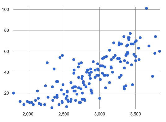
Scatter plots show us a collection of points, arranged along two axes. If there’s a relationship between these axes, we’ll see clumps and clouds of points in the graph.
Here’s an example of a point cloud in a scatter plot from a different data set. We could describe these points as clustering around a line that slopes from the bottom left to the top right.

-
What pattern do you see in your scatter plot?
-
Are there any points that seem unusual? Why?
-
Suppose we plotted the age and adoption time of four random animals, and found that they all fell in a line. Is this enough to determine that there’s a relationship between the variables?
-
No! Just as four flips of a fair coin might come up tails, four points chosen from a scatter plot with no pattern might still fall on a line! As our sample size increases, the chance of us seeing a pattern by random chance gets smaller and smaller.
-
When you created the scatter plot by hand, you started with a Table. Then you plotted a series of dots, using one column for your x’s, one column for your y’s, and the name column to provide a label for each dot.
Pyret has a scatter-plot function that works exactly the same way: it starts with a table, and then needs to know which columns to use for labels , x-coordinates (xs), and y-coordinates (ys). Here’s the Contract:
|
-
Open your saved Animals Starter File, or make a new copy.
-
Make a scatter plot that displays the relationship between
ageand adoption time (weeks).
To do this, students will need to type in: scatter-plot(animals-table,"name", "age", "weeks")
-
Are there any patterns or trends that you see here?
-
It appears that younger animals get adopted more quickly.
-
What about Line Graphs?
Line graphs and scatter plots have a lot in common! They both visualize the relationship between two columns, and both columns must be quantitative.
There is an important difference, however, in that line graphs are used when change is continuous. Only in this situation can it be appropriate to "connect the dots", because they represent the rise and fall of a measure over time. For example, if we know that the temperature was 80 degrees at 5pm and 70 degrees at 7pm, we can be sure that it was 73 degrees somewhere in between there. In contrast, if we made a plot about the worth of nickels, we’d have a point connecting 3 nickels and 15 cents and another connecting 5 nickels and 25 cents, but it would not make sense to declare the worth of 3.5 nickels (since it’s not possible to have half a nickle… unless you broke the law and sawed one in half, in which case it wouldn’t be worth anything.)
For students who want to use line graphs, the Contract is:
# line-graph :: (Tabletable-name, Stringlabels, Stringxs, Stringys) -> Image
Synthesize
How do patterns or trends show up in a scatter plot?
🔗Does Size Affect Adoption Time? 15 minutes
Overview
Students apply what they’ve learned about scatter plots to the Data Cycle, using it to answer questions about relationships in the animals dataset.
Launch
Is age the only factor that determines how long it takes for an animal to get adopted?
Have students discuss.
Many apartment buildings do not allow large breeds of dogs, and have a limit on how heavy a tenant’s dog can be. Bigger dogs are not welcome in many apartments.
Perhaps the weight of an animal influences the adoption time!
Take a look at the Animals Dataset on the spreadsheet or on this page (for those using a printed workbook, you’ll find it at the front). Do you think there’s a relationship between pounds and weeks in this table? Why or why not?
Do you think there’s a relationship between pounds and weeks in this table? Why or why not?
Investigate
Complete the first Data Cycle on Data Cycle: Relationships in the Animals Dataset.
Discuss as a class:
-
What did you find when you looked at the scatter-plot?
-
Does there appear to be a pattern or trend?
-
What might be problematic about including every species in the same scatter plot of weight?
-
What follow-up questions do you have?
Write your follow-up question in the second Data Cycle on Data Cycle: Relationships in the Animals Dataset, and complete the Data Cycle for your new question.
Synthesize
There are many ways to visualize or reason about single columns of data.
-
What is special about scatter plots?
-
They let us see relationships between two columns!
-
-
What did you learn through your Data Cycle?
-
What new questions did it lead you to ask?
🔗Looking for Trends 20 minutes
Overview
Students are asked to identify patterns in their scatter plots. This activity builds towards the idea of linear associations, but does not go into depth (as as a later lesson on correlations does).
Launch
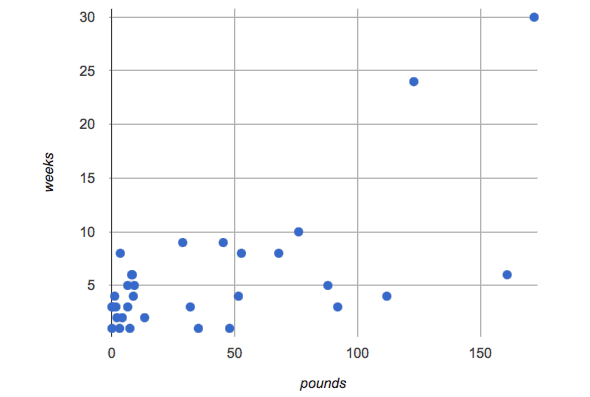
Shown below is a scatter plot of the relationships between the animals' pounds and the number of weeks it takes to be adopted.

-
Does the number of weeks to adoption seem to go up or down as the weight increases?
-
Are there any points that “stray from the pack”? Which ones?
Teaching Tip
Project the scatter plot at the front of the room, and have students come up to point out their patterns.
A straight-line pattern in the cloud of points suggests a linear relationship between two columns. If we can find a line around which the points cluster (as we’ll do in a future lesson), it would be useful for making predictions. For example, our line might predict how many weeks a new dog would wait to be adopted, if it weighs 68 pounds.
-
Do any data points seem unusually far away from the main cloud of points?
-
Which animals are those?
These points are called unusual observations. Unusual observations in a scatter plot are like outliers in a histogram, but more complicated because it’s the combination of x and y values that makes them stand apart from the rest of the cloud.
Unusual observations are always worth thinking about!
-
Sometimes unusual observations are just random. Felix seems to have been adopted quickly, considering how much he weighs. Maybe he just met the right family early, or maybe we find out he lives nearby, got lost and his family came to get him. In that case, we might need to do some deep thinking about whether or not it’s appropriate to remove him from our dataset.
-
Sometimes unusual observations can give you a deeper insight into your data. Maybe Felix is a special, popular (and heavy!) breed of cat, and we discover that our dataset is missing an important column for breed!
-
Sometimes unusual observations are the points we are looking for! What if we wanted to know which restaurants are a good value, and which are rip-offs? We could make a scatter plot of restaurant reviews vs. prices, and look for an observation that’s high above the rest of the points. That would be a restaurant whose reviews are unusually good for the price. An observation way below the cloud would be a really bad deal.
Investigate
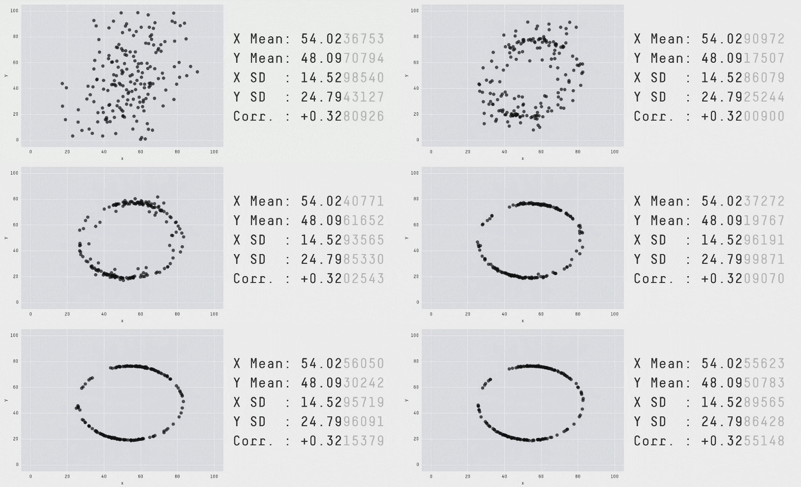
Data Scientists and Statisticians use their eyes all the time. Sometimes there’s a pattern hiding in the data, which can’t be seen just by focusing on numbers and measures. Until we really look at the shape of the data, we aren’t seeing the whole picture.
Look at both numbers and displays before drawing conclusions.
Each of these scatter plots and accompanying set of numbers corresponds to a dataset. The patterns in the scatter plots vary wildly, but the numbers that summarize the datasets barely change at all!

This animation is from Autodesk, which has an amazing page showing off how similar numbers can be generated from radically different scatter plots. If time allows, have students explore more of Autodesks' Same Stats, Different Graphs visualizations!
For practice, complete Exploring Relationships Between Columns.
All of the questions on this page are phrased as "how is the explanatory variable related to the response variable?""
Debrief, showing the plots on the board. Make sure students see plots for which there is no relationship!
It is important to note that making a scatter plot will not always give us the information we’re looking for.
If we wanted to know how weeks to adoption may be affected by age, for example, it would be important to consider the fact that different species have very different lifespans!
A 5-year-old tarantula is still really young, while a 5-year-old rabbit is fully grown.
With differences like this, it doesn’t make sense to put them all on the same scatter plot because we may be hiding a real relationship, or creating the illusion of a relationship that isn’t really there!
There are ways to define functions of your own and extend Pyret to deepen your analysis. Our lesson on Advanced Displays supports students in creating more useful and engaging charts that allow them to dig further into their data.
Synthesize
-
Imagine a scatter plot of height v. age for K-12 students. What would you expect it look like, and why?
-
Because children grow taller from age 5 to 18, we would expect to see a point cloud sloping upward to the right, with younger students tending to be shorter, and older students tending to be taller.
-
-
Imagine a scatter plot comparing the number of Marvel movies produced each year to the number of car accidents each year. What would you expect it to look like?
-
There is no relationship between Marvel movies and car accidents, so we wouldn’t expect the points to be clustered around a line.
-
🔗Data Exploration Project (Scatter Plots) flexible
Overview
Students apply what they have learned about scatter plots to their chosen dataset. They will add two items to their Data Exploration Project Slide Template: (1) at least two scatter plots and (2) any interesting questions that emerge.
Visit Project: Dataset Exploration to learn more about the sequence and scope. Teachers with time and interest can build on the exploration by inviting students to take a deep dive into the questions they develop with our Project: Research Capstone.
Launch
Let’s review what we have learned about making and interpreting scatter plots.
-
Does a scatter plot display categorical or quantitative data? How many columns of data does a scatter plot display?
-
Scatter plots display two columns of quantitative data and a third column of quantitative or categorical data is used to label the points.
-
-
What do scatter plots show us about a dataset?
-
Scatter plots allow us to look for relationships between two columns of dataset.
-
Investigate
Let’s connect what we know about scatter plots to your chosen dataset.
Students have the opportunity to choose a dataset that interests them from our List of Datasets in the Choosing Your Dataset lesson.
-
Open your chosen dataset starter file in Pyret.
-
Choose two quantitative columns from your dataset whose relationship you want to explore, and another column that makes sense to use as labels for your points.
-
Create a scatter plot.
-
What question does your display answer?
-
Possible response: What is the relationship between column A and column B of my dataset?
-
-
Write down that question in the top section of Data Cycle: Relationships in Your Dataset.
-
Complete the rest of the data cycle, recording how you considered, analyzed and interpreted the question.
-
Repeat this process for at least one other pair of quantitative columns.
Confirm that all students have created and understand how to interpret their scatter plots. Once you are confident that all students have made adequate progress, invite them to access their Data Exploration Project Slide Template from Google Drive.
It’s time to add to your Data Exploration Project Slide Template.
-
Copy/paste at least two scatter plots.
-
Be sure to also add any interesting questions that you developed while making and thinking about your scatter plots.
You may need to help students locate the “Scatter plot” slide in the "Making Displays" section. They will need to duplicate the slide to add their second display. The “My Questions” section is at the end of the slide deck.
Synthesize
Have students share their findings.
-
Were the relationships you investigated stronger or weaker than you expected?
-
What questions did the scatter plots raise about your dataset?
-
What, if any, outliers did you discover when making scatter plots?
-
Were there any surprises when you compared your findings with other students? (For instance: Did everyone find outliers? Was there more or less similarity than expected?)
These materials were developed partly through support of the National Science Foundation, (awards 1042210, 1535276, 1648684, 1738598, 2031479, and 1501927).  Bootstrap by the Bootstrap Community is licensed under a Creative Commons 4.0 Unported License. This license does not grant permission to run training or professional development. Offering training or professional development with materials substantially derived from Bootstrap must be approved in writing by a Bootstrap Director. Permissions beyond the scope of this license, such as to run training, may be available by contacting contact@BootstrapWorld.org.
