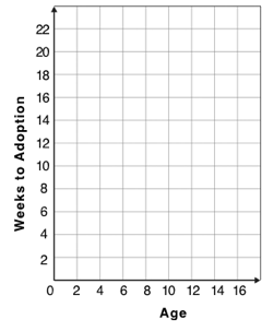
1 The table below has some new animals!
|
|
2 Plot the rest of the animals - one at a time - labeling each point as you go. After each animal, ask yourself whether or not you see a pattern in the data.
3 After how many animals did you begin to see a pattern?
4 Use a straight edge to draw a line on the graph that best represents the pattern you see, then circle the cloud of points around that line.
5 Are the points tightly clustered around the line or loosely scattered?
6 Does this display support the claim that younger animals get adopted faster? Why or why not?
7 Place points on the graph to create a scatter plot with NO relationship. |
|
These materials were developed partly through support of the National Science Foundation, (awards 1042210, 1535276, 1648684, 1738598, 2031479, and 1501927).  Bootstrap by the Bootstrap Community is licensed under a Creative Commons 4.0 Unported License. This license does not grant permission to run training or professional development. Offering training or professional development with materials substantially derived from Bootstrap must be approved in writing by a Bootstrap Director. Permissions beyond the scope of this license, such as to run training, may be available by contacting contact@BootstrapWorld.org.
