(Also available in CODAP)
Students deepen their understanding of scatter plots, learning to describe and interpret direction and strength of linear relationships.
Lesson Goals |
Students will be able to…
|
Student-facing Lesson Goals |
|
Materials |
|
Supplemental Materials |
|
Preparation |
|
Key Points For The Facilitator |
|
🔗Correlations have Form 5 minutes
Overview
Students identify and make use of patterns in scatter plots, learning to characterize them as appearing to be linear, curved, or showing no clear pattern. Determining that a form appears to be linear is a prerequisite for proceeding to correlation and linear regression.
Note: We can’t make any definitive assertions about correlations without computation, which students will learn about in our Linear Regression lesson, but it doesn’t make sense to search for correlations when there’s no pattern at all, and summarizing with a correlation only makes sense for linear relationships, so it is important for students to develop an intuitive sense of what form means before engaging with the abstraction of computation.
Launch
We can analyze a single quantitative variable, such as age or pounds to identify a value that is typical, how much the values vary, and what kind of values are usual or unusual.
(The bolded words above all deal with notions of what it means for a value to be "normal" or "abnormal". These words have loaded meaning in the context of variability, and should be used carefully!)
But those analyses tell us nothing about the relationship between animals' ages and weights. In order to understand such relationships, we have to expand our view from one column to two. This goes hand-in-hand with expanding our display from a 1-dimensional histogram or box plot to a 2-dimensional scatter plot.
Rather than summarizing each distribution in one dimension, we can search for a linear relationship between two quantitative variables.
Linear relationships only make sense if the scatter plot follows a straight-line pattern, so the first thing we need to ask is whether the form of the relationship appears to be linear or not.
Investigate
Form indicates whether a relationship is linear, nonlinear or undefined:
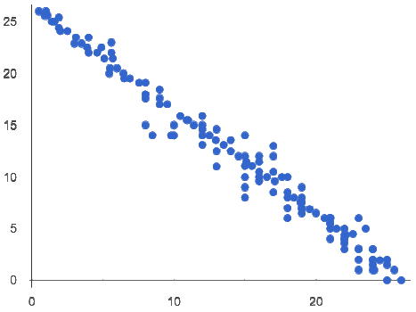
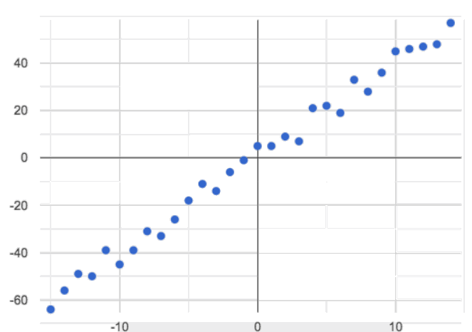
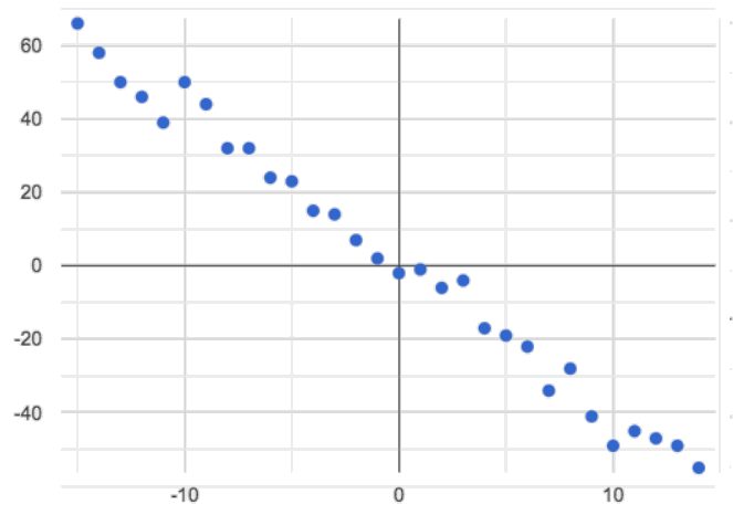
Some patterns are linear, and cluster around a straight line sloping up or down.
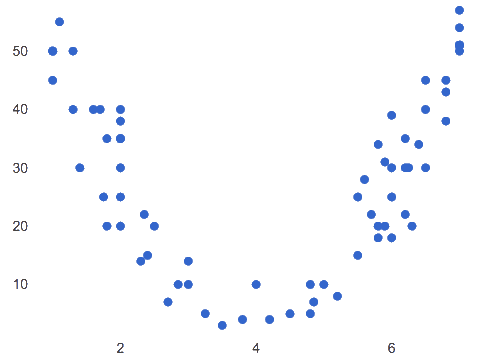
Some patterns are nonlinear, and may look like a curve, a hockey-stick, or some other shape!
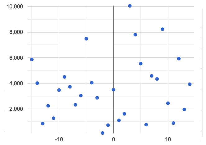
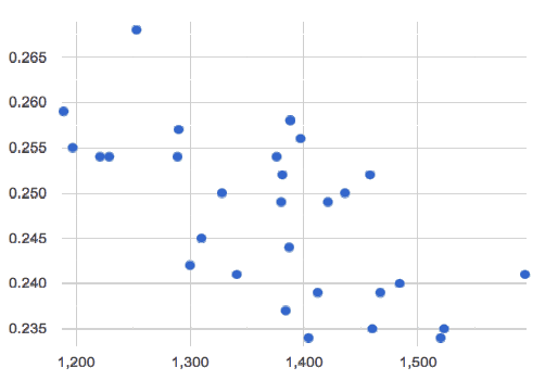
And sometimes there is no relationship or pattern at all! That means there’s no predictable change in the y-axis as we go from one side of the x-axis to the other.
|
|
|
Linear |
Nonlinear |
No Relationship |
Turn to Identifying Form, Direction and Strength, and complete just the first question for each scatter plot, identifying whether the relationship appears to be linear, nonlinear or if there’s no relationship at all.
Synthesize
-
Which scatter plots seem to have linear relationships?
-
Students should feel very confident that A and C seem to have linear relationships.
-
Students will likely also identify D and F as seeming to have linear relationships.
-
-
Which scatter plots seem to have nonlinear relationships?
-
Scatter plot E seems to have a non-linear relationship.
-
-
Which scatter plots seem to have no relationships?
-
Scatter plot B seems to have no relationship.
-
Data Scientists use their eyes all the time! It doesn’t make sense to search for correlations when there’s no pattern at all, and summarizing with a correlation only makes sense for linear relationships!
Going Deeper
In an AP Statistics class or full-year Data Science class, it’s appropriate to discuss nonlinear relationships here. In a dedicated computer science class, it may also be appropriate to talk about transforming the x- or y-axis (using build-column!) via a quadratic, exponential, or logarithmic function and then looking for a linear pattern in the resulting scatter plot. All of these are extensions to the materials presented here.
🔗Correlations have Direction 10 minutes
Overview
Once students have learned to identify a possible linear relationship, they can turn their attention to other qualities of that relationship, like its direction.
Launch
We can also examine the direction of a linear relationship.
|
|
Positive Direction |
Negative Direction |
A positive direction means that the line slopes up as we look from left-to-right. Positive relationships are by far most common because of natural tendencies for variables to increase in tandem. For example, “the older the animal, the more it tends to weigh”. This is usually true for human animals, too!
A negative direction means that the line slopes down as we look from left-to-right. Negative relationships can also occur. For example, “the older a child gets, the fewer new words he or she learns each day.”
If the form is nonlinear or non-existent, "direction" doesn’t apply: A parabola might look like it has both a positive and negative correlation, and if there’s no form at all then there certainly can’t be a direction!
Investigate
Complete Identifying Form, Direction and Strength and focus just on the second question, determining whether each of the possible linear relationships you previously identified appears to have a positive or negative correlation.
Synthesize
-
It only makes sense to look for direction in linear relationships!
-
Which data sets appear to have a positive correlation between the variables?
🔗Correlations have Strength 10 minutes
Overview
We’ll explore another quality of a possible linear relationship: its strength.
Launch
Strength indicates how closely the two variables are correlated.
A relationship is strong if knowing the x-value of a data point gives us a very good idea of what its y-value will be (knowing a student’s age gives us a very good idea of what grade they’re in). A strong linear relationship means that the points in the scatter plot are all clustered tightly around an invisible line.
A relationship is weak if x tells us little about y (a student’s age doesn’t tell us much about their number of siblings). A weak linear relationship means that the cloud of points is scattered very loosely around the line.
We can ask ourselves, "How well does knowing the x-value allow us to predict what the y-value will be?"
|
|
Strong Relationship |
Weak Relationship |
If the form is non-existent, "strength" doesn’t apply: without any form at all, there’s nothing for data points to be tightly or loosely clustered around and predictions aren’t possible!
Investigate
Complete Identifying Form, Direction and Strength, and focus on the third question for each scatter plot, identifying whether the relationship appears to be strong or weak.
If time permits, have students complete Identifying Form, Direction and Strength (Matching) and/or the Identifying Direction and Strength (Desmos) card sort.
Common Misconceptions
-
Students often conflate strength and direction, thinking that a strong correlation must be positive and a weak one must be negative.
-
Students may also falsely believe that there is ALWAYS a correlation between any two variables in their dataset.
-
Students often believe that strength and sample size are interchangeable, leading to mistaken assumptions like "any correlation found in a million data points must be strong!"
Synthesize
Think-Pair-Share: Reflection on Form, Direction and Strength
-
Take a couple of minutes to answer the questions on your own.
-
Then discuss your thinking with your partner.
-
What has to be true about the shape of a relationship in order to start talking about a correlation?
-
It must be linear
-
-
What is the difference between a weak relationship and a negative relationship?
-
A weak relationship is one in which knowing the x-value does not allow us to predict the y-value very well, and the points are not clustered tightly around a line whereas, if a relationship is negative, it means that one variable decreases as the other increases.
-
-
What is the difference between a strong relationship and a positive relationship?
-
A strong relationship is one in which (1) knowing the x-value allows us to predict the y-value very well, and (2) the points are clustered tightly around a line, whereas if a relationship is positive, it means that the variables increase together.
-
-
If we find a strong relationship in a sample from a larger population, will that relationship always hold for the whole population? Why or why not?
-
No. Maybe the sample was biased, or maybe it was random but we just happened to choose points for which there is a correlation.
-
-
If two correlations are both positive, is the stronger one more positive (steeper slope) than the other
-
No. Direction and Strength are unrelated
-
-
A news report claims that after surveying 10 million people, a positive correlation was found between how much chocolate a person eats and how happy they are. Does this mean eating chocolate almost certainly makes you happier? Why or why not?
-
No. A correlation drawn from a giant sample can still be a weak correlation! Sample size is not connected to strength.
-
🔗Summarizing Correlations using r-values 20 minutes
Overview
Now that students know how to identify direction and strength for linear relationships, they’ll learn to read how these are expressed in the r-value.
Launch
We have learned that a correlation can be described by three pieces of information: Form, Direction, and Strength.
Statisticians and Data Scientists have a shorter way of describing all three, called r-value.
-
r is positive or negative depending on whether the correlation is positive or negative.
-
The strength of a correlation is the distance from zero:
-
an r-value of zero means there is no correlation at all
-
a perfect correlation would be either represented by −1 or 1
-
Typically, r-values are categorized as follows:
-
±0.65 or ±0.70 or more is considered a strong correlation.
-
±0.35 to ±0.65 is “moderately correlated”.
-
less than ±0.25 or ±0.35 may be considered weak.
These cutoffs are not an exact science, however! In some contexts an r-value of ±0.50 might be considered impressively strong!
If it works for you, give students five minutes to play a few rounds of the online game Guess the Correlation to develop intuition with r-values. (This will require creating an account.)
Investigate
-
Complete Identifying Form and r-Values.
-
For each scatter plot, identify whether the relationship appears to be linear, and, if so, use r to summarize direction and strength.
Calculating r from a dataset only tells us the direction and strength of the relationship in that particular sample. If the correlation between adoption time and age for a representative sample of about 30 shelter animals turns out to be +0.44, the correlation for the larger population of animals will probably be close to that, but certainly not the same.
-
Let’s look for correlations in the Animals Dataset!
-
Open your saved Animals Starter File, or make a new copy.
-
Complete Correlations in the Animals Dataset.
 It’s easy to be seduced by large r-values, and believe that we’re really onto something that will help us claim that one variable really impacts another! But Data Scientists know better than that…
Correlation does NOT imply causation.
If time allows, you may want to emphasize the point that correlation does not imply causation by having students look at the nonsense claims that could be made from the graphs of real world data on the Spurious Correlations website.
Common Misconceptions
Pay close attention to students' language when describing their correlations, and make sure they are not using causative wording!
Students often giggle at some of the Spurious Correlations examples, but fail to internalize the point when it comes to the Animals dataset or their own analysis.
Synthesize
-
Which corresponded more strongly with time to adoption,
"age"or"pounds"? -
What does this mean?
-
The correlation with
"pounds"is higher, meaning that an animal’s weight is a better predictor of the number of weeks an animal will live at the shelter before being adopted than its age.
-
-
People often confuse correlation with causation. What are some examples of this?
-
Why is it a problem for society, that people confuse correlation and causation?
🔗Exploration Project (Correlations) flexible
Overview
Students apply what they have learned about correlations to their chosen dataset. They will add two or more items to their Data Exploration Project Slide Template: (1) a correlation they think they see in the data set, and (2) the form, direction and strength of that correlation.
Visit Project: Dataset Exploration to learn more about the sequence and scope. Teachers with time and interest can build on the exploration by inviting students to take a deep dive into the questions they develop with our Project: Research Capstone.
Launch
Let’s review what we have learned about correlations.
-
What kind of displays can we use to visualize a correlation?
-
Scatter plots are used to visualize correlations.
-
-
When Data Scientists describe correlations to one another, what three properties do they talk about, and what do they mean?
-
Form - describes the shape of a correlation. Correlations can be linear, nonlinear, or non existant (N/A).
-
Direction - linear correlations can be positive or negative, describing whether the point cloud seems to rise or fall as the explanatory variable gets larger.
-
Strength - describes how tightly the data is clustered around a line or curve.
-
Investigate
Let’s connect what we know about correlations to your chosen dataset.
Students have the opportunity to choose a dataset that interests them from our List of Datasets in the Choosing Your Dataset lesson. If you’d prefer to focus your class on a single dataset, we recommend the Global Food Supply & Production Starter File.
-
Open your chosen dataset starter file in Pyret.
-
Turn to Correlations in My Dataset, and list three correlations you’d like to search for.
-
Pick one correlation to explore. Which column do you think is the explanatory variable? The response variable?
-
Make a scatter plot with the explanatory variable on the x-axis and the response variable on the y-axis.
-
Do you see a correlation? What is its form? If it’s linear, what is its direction and strength?
-
Repeat this process for at least one more correlation.
Confirm that all students have created and understand how to interpret their correlations. Once you are confident that all students have made adequate progress, invite them to access their Data Exploration Project Slide Template from Google Drive.
It’s time to add to your Data Exploration Project Slide Template.
-
Find the "Correlations I want to look into" section of the slide deck.
-
For each correlation you wrote in Correlations in My Dataset, copy what you wrote into the slide.
-
On the same slide, add your scatter plot and your description of the result.
-
Repeat the process for each additional correlation you explored, making copies of the correlation slide as needed.
Synthesize
Have students share their findings.
-
Did you discover anything surprising or interesting about your dataset?
-
Were any of the correlations especially strong? Were any of them surprising?
-
Were there any surprises when you compared your findings with other students? (For instance: Did everyone find a strong correlation? A linear one?)
These materials were developed partly through support of the National Science Foundation, (awards 1042210, 1535276, 1648684, 1738598, 2031479, and 1501927).  Bootstrap by the Bootstrap Community is licensed under a Creative Commons 4.0 Unported License. This license does not grant permission to run training or professional development. Offering training or professional development with materials substantially derived from Bootstrap must be approved in writing by a Bootstrap Director. Permissions beyond the scope of this license, such as to run training, may be available by contacting contact@BootstrapWorld.org.

