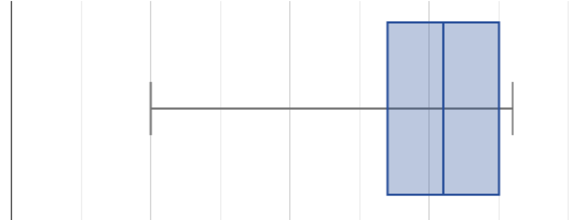
A class of students took five different exams this year, and each distribution of their scores has been plotted in one of the five box plots below.
Match the summary description (left) with the shape of the box plot of student scores (right).
|
1 |
A |
Most students did pretty well on this exam, but there were some mediocre scores and a handful of very low scores. |
|
|
2 |
B |
This exam featured one question worth a lot of points that many of the students got completely right, while many others got it completely wrong. Nobody actually got the "average" score. |
|
|
3 |
C |
A lot of students did poorly on this exam. Relatively few did just OK. Still, a bunch of students who really knew what they were doing completely aced it. |
|
|
4 |
D |
Performance on this exam resulted in a classic "bell curve" shape: most students performed close to the average and scores far from the average in either direction were increasingly unlikely. |
|
|
5 |
E |
This was a hard exam. Most students did poorly, with scores tapering to the point where hardly anyone got an A. |
These materials were developed partly through support of the National Science Foundation, (awards 1042210, 1535276, 1648684, 1738598, 2031479, and 1501927).  Bootstrap by the Bootstrap Community is licensed under a Creative Commons 4.0 Unported License. This license does not grant permission to run training or professional development. Offering training or professional development with materials substantially derived from Bootstrap must be approved in writing by a Bootstrap Director. Permissions beyond the scope of this license, such as to run training, may be available by contacting contact@BootstrapWorld.org.


